A Swell of Warblers
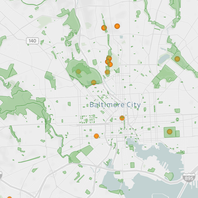
Tools: R, Tableau Link: Tableau Public Link About: This viz was an exercise in spatial data. This was made before the recent update to Tableau that allows layers on maps, and so I created this by layering several different maps and worksheets on top of each other to create the layered effect. This particular viz […]
Animal Crossing Wildlife Browser
Tools: R, Tableau Link: Tableau Public Link About: This was created when I was really into ACNH. Lots of data to work with in a game like that, and a browser dashboard seemed appropriate. Solving the dynamic images for the various animals was a challenge, but worthwhile I think. A lot of what I learned […]
Baltimore City Schools Risk of COVID19 Transmission
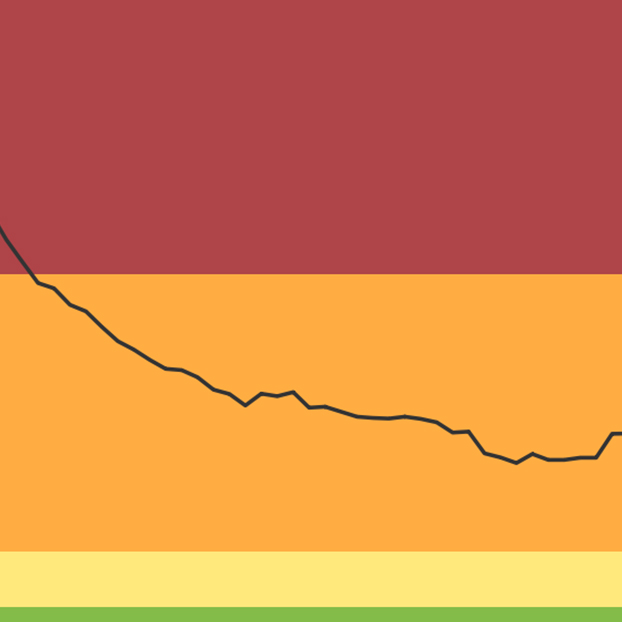
Tools: TableauLink: View on Tableau PublicAbout: I noticed that there was a public facing Google Sheet maintained by a member of the Baltimore Teacher’s Union tracking COVID metrics as they related to Baltimore City Schools and their reopening, and thought that the message could be amplified via a simple viz. I reached out and asked […]
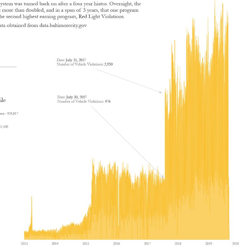
Baltimore, the City that Speeds
Tools: R, Tableau, Illustrator About: This one is a bit older, and if I were to do it again there are many design decisions I’d do very differently. However, I still think it’s pretty fun, and extremely eye opening. Perhaps soon I’ll return to the data set with fresh eyes and put something a bit […]
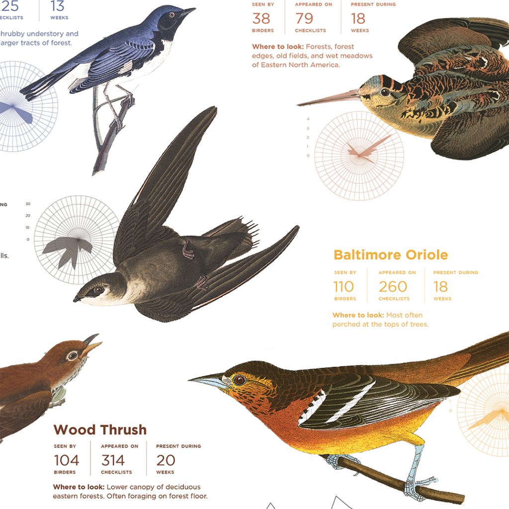
Birds and Birding at Patterson Park
Masters Thesis from the Data Analytics and Visualization program at MICA
Birds and Birding at Patterson Park – 2019
Tools: R, TableauLink: View on Tableau Public About: This is in many ways a precursor to what would become my final thesis project at MICA. This was an experiment with using shape as narrative, highlighting the boxes motif throughout the piece. This was also the first dashboard I created where I realized bird data had […]
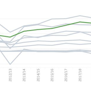
High School Female Athlete Participation
Tools: TableauLink: View on Tableau Public About: The challenge here was to create a dashboard that used only a single call out color. I decided to take a stab at a Makeover Monday for this, and while this is a fairly straight forward end product, I’m quite happy with the result and functionality.
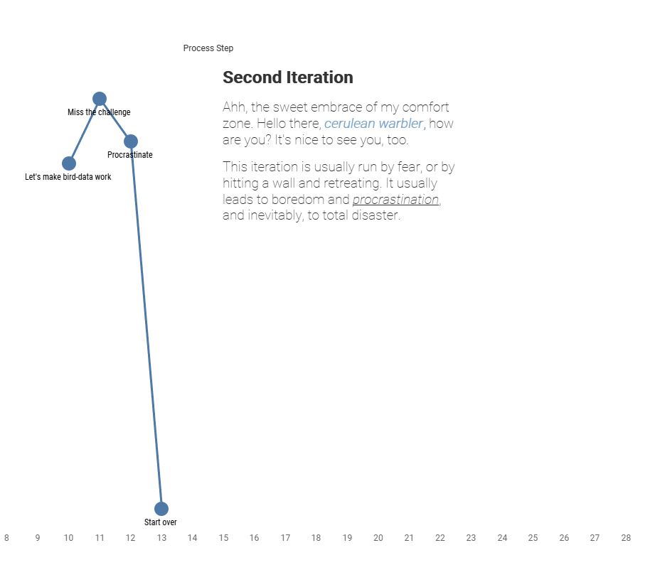
My Creative Process
Tools: TableauLink: View on Tableau Public
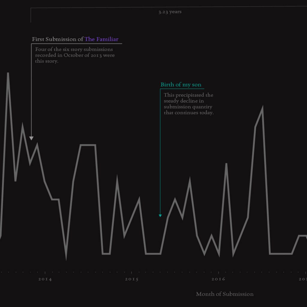
Shifting Priorities
Tools: R, Illustrator About: I have a large excel file where I track all fiction submissions. I knew that my submissions had been down since my son was born, but thought it would be fun to visualize the timeline, and point out key moments in my life. I highlighted on story in particular throughout, which […]
